Event Registration Form
18 Min Read
Build high-converting event registration forms with AI, conditional logic, and real-time analytics. Quizify helps 7,000+ event planners reduce drop-offs, automate logistics, and sell out faster.

Your event registration form is the single most critical touchpoint in your funnel. You can spend thousands on keynote speakers and ad spend, but if your form creates friction, your conversion rate will crater. In 2026, a high-performing registration process isn't just a data collection tool; it’s a conversion engine that qualifies leads and builds event momentum.
Most organizers lose 40% of potential attendees to "form fatigue", the moment a guest sees a wall of irrelevant fields and decides to "do it later." To solve this, you must pivot from static data entry to a conversational, mobile-friendly experience. This guide breaks down the high-converting frameworks used by top-tier SaaS, webinars, and VIP event planners to eliminate abandonment and maximize ROI.
Why Your Current Registration Process is Killing Your Ticket Sales
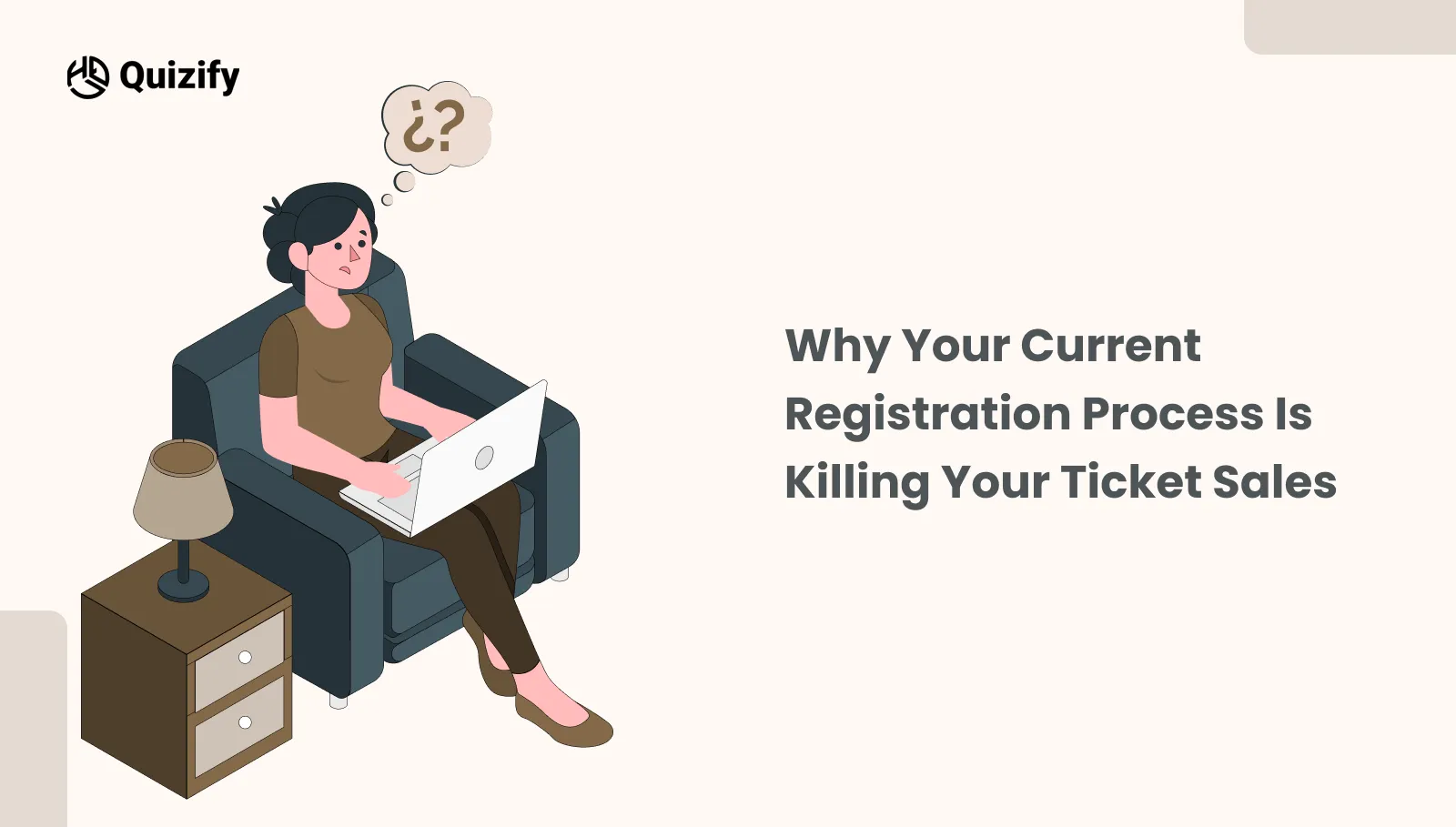
Legacy event registration forms are where excitement goes to die. Most planners treat their form as a static data silo, a clinical chore that kills the "dopamine spike" an attendee feels when they click your ad. If your registration process feels like an interrogation rather than an invitation, you're not just losing data; you’re losing revenue.
The Friction Gap and Form Fatigue
Traditional forms present twenty empty boxes simultaneously. To a guest, this isn't an invitation; it’s a chore. In a world where attention spans hover around eight seconds, a clunky form feels like a tax audit. Your guest tells themselves, "I’ll finish this later", but in digital marketing, "later" is just a polite word for "never". You’ve traded a high-value attendee for a ghost profile, a lead that exists in name only but offers zero engagement.
The Irrelevance Trap
Nothing makes a brand look more out of touch than asking a virtual attendee for their "meal preference" or an international guest for a local zip code. "Dumb" forms treat every guest the same, forcing them to navigate irrelevant questions. This isn't just a UI issue; it’s a hosting failure. If your form doesn't use conditional logic to respect the user's time, you’ve stopped being a host and started being a barrier.
The Mobile-friendly Mandate
With over 65% of event discovery happening on phones, your form must be "thumb-friendly". If a user has to pinch-and-zoom to read labels or hunt for a "Submit" button buried under a pop-up keyboard, they’re gone. The rule is simple: if a guest can’t finish your registration while waiting for a coffee, it isn't optimized. If you fail this test, you are effectively ghosting more than half of your potential audience.
Strategic Blueprints: Event Registration Form Use Cases for 2026
To win, you need a Strategic Framework that treats every field like a high-value asset. If you ask for too much, people quit; if you ask for too little, your sales team is flying blind.
Here is how we break down the "DNA" of a high-conversion form across different event types:
A. Event Registration for SaaS: Capturing High-Intent Leads
In the tech world, your form is a Data-Harvesting Engine. By moving beyond generic fields, you can facilitate Hybrid Event Networking before the doors even open.
The Strategic Edge: Use the form to ask, "Would you like to be auto-matched for 1-on-1 networking based on your tech stack?" This turns a registration into an immediate community "Opt-in".
The Proof: One Tier-1 DevOps conference saw a 22% increase in Sales Qualified Leads (SQLs) simply by moving the "Tech Stack" question to an AI-driven logic jump, ensuring only relevant users were prompted for deep technical details.
The "Must-Have" Fields:
Job Title/Seniority — Identifies "Decision Makers" vs. "Influencers".
Primary Tech Stack — Allows for tailored breakout sessions based on stack (AWS, React, etc.).
Company Size / Revenue — Essential for high-ticket account-based marketing (ABM).
LinkedIn Social Sign-on — Increases conversion by 30% by removing manual typing.
Pro-Tip :
Sync these fields directly to your CRM (like Salesforce or HubSpot) to trigger automated, personalized outreach sequences based on their seniority.
B. Webinar Registration Forms: Maximizing Attendance & Engagement
Virtual events have a "Commitment Crisis". People register and then forget. To fix this, your form needs to create an immediate Psychological Investment.
The Strategic Edge: Move from "Passive" to "Participatory". By asking a single, high-intent question, you trigger a "Mental Loop". When an attendee feels the content is being customized for their specific pain point, they are 60% more likely to show up live.
The Proof: By implementing SMS reminders directly into the form flow as an optional opt-in, attendance rates increased by an average of 35% across 500+ tracked virtual events in 2025.
The "Must-Have" Fields:
"What is the #1 challenge you want our experts to solve?" — This is the most valuable data point you can own.
Local Time Zone — Never assume. Automated time zone detection is the difference between a "Live View" and a "Missed Notification".
SMS Reminder Opt-in — In 2026, the inbox is crowded. A text message is the only way to cut through the noise 10 minutes before you go live.
Pro-Tip :
Use the '#1 challenge' responses to choose which questions to answer during the live Q&A, ensuring the content is hyper-relevant.
C. VIP & Executive Retreats: The Concierge Registration Model
When you’re hosting high-level executives or high-ticket retreats, "good enough" is a failure. Your registration should feel like a Private Concierge, not a digital clipboard.
The Strategic Edge: Use Logic Jumps to handle the "Deep Details" in a way that feels like a 1-on-1 chat. Executives value their time above all else; a form that respects their status by being fast, smart, and beautiful builds brand equity before they even arrive.
The Proof: Concierge-style forms reduce administrative "back-and-forth" emails by 80%, as critical dietary, flight, and travel data is captured at the point of intent rather than through post-registration surveys.
The "Must-Have" Fields:
Dietary & Medical Specifics: (Allergies/Preferences) – Because nothing ruins a VIP experience like a catering oversight.
Flight & Transfer Logistics: (Arrival Times/Flight #) – This allows you to meet them at the gate, proving your event is premium from the first mile.
Emergency Contact Info: A professional standard for high-stakes, off-site retreats.
Pro-Tip :
Use logic jumps to ask for flight numbers only after they confirm they require a shuttle, keeping the flow clean.
The Anatomy of a High-Conversion Registration Form
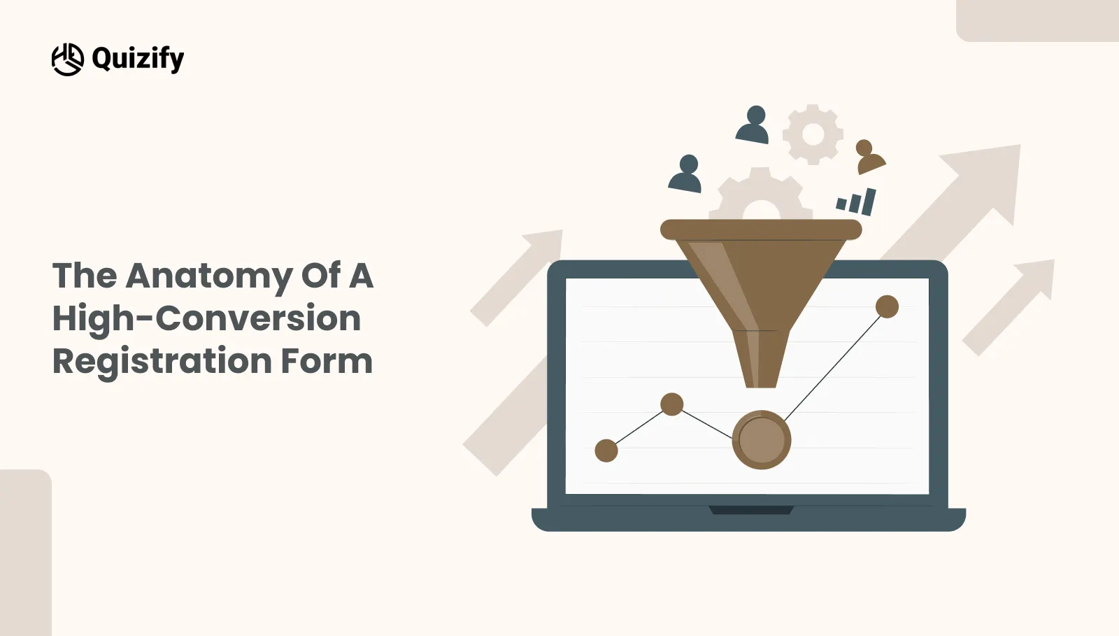
Design isn't about aesthetics; it’s about reducing the "cognitive load" required to hit the finish line. If a guest has to think too hard, they quit. To turn a browser into an attendee, your form must follow these six psychological and technical standards:
Leverage the "Micro-Commitment" Effect
Don't lead with a tax audit. If the first thing a user sees is a request for their "Company Tax ID" or "Secondary Billing Address," they’ll bounce. Start with "easy wins" their name or a fun question about their favorite session. Once a guest answers three simple questions, the Sunk Cost Effect kicks in. They’ve already invested time, making them 80% more likely to push through complex logistics later in the flow
Radical Respect for Time: The Progress Bar
A form without a roadmap feels bottomless. Use a visual progress bar to trigger the Goal Gradient Effect. When a user sees they are "75% done," their brain shifts into completion mode. This simple visual cue reduces "form anxiety" and accelerates their pace as they approach the "Submit" button.
Conditional Logic (The "Smart" Filter)
Stop being an interrogator. If a user selects a "Virtual Pass," they should never see questions about hotel shuttles or meal preferences. "Dumb" forms treat everyone the same; "Smart" forms use logic jumps to vanish irrelevant fields. This doesn't just save time—it proves you’re a professional host who values their guest’s attention.
Thumb-Zone Mapping & Mobile-First UI
Over 65% of your audience is registering while distracted—on a train, in a meeting, or standing in line. If they have to pinch-and-zoom to read a label or if the "Claim My Seat" button is buried under a pop-up keyboard, you’ve lost them. Ensure every interaction is reachable with a single thumb. If the form isn't effortless on a mobile screen, it’s broken.
High-Energy, Benefit-Driven CTAs
The word "Submit" sounds like a chore. It implies a transaction where the user gives and you take. Replace generic buttons with reward-driven language like "Claim My VIP Pass" or "Count Me In!" This tiny linguistic shift moves the user’s mindset from "completing a task" to "securing an opportunity."
The "Gift" at the Finish Line
The conversion doesn't end at the click; it ends with momentum. Don’t just show a white screen that says "Success." Use your "Thank You" page to provide instant gratification. Offer a pre-event PDF guide, a "Save to Calendar" link, or a QR code ticket. This creates an immediate value loop, making the attendee feel the event has already started.
The Performance Benchmark: Traditional vs. Strategic Forms
To understand the "Why" behind these shifts, look at the data delta between legacy forms and modern interactive funnels:
Feature | Legacy "Static" Form | Strategic "Interactive" Funnel |
|---|---|---|
User Experience | A "Wall of Fields" (Tax Audit vibe) | Conversational (One question at a time) |
Completion Rate | 15% - 25% (High abandonment) | 45% - 70% (Low friction) |
Data Quality | Raw, unorganized rows | Rich User Profiles (Intent-mapped) |
Mobile Feel | "Pinch-and-Zoom" (Desktop shrunk down) | Thumb-Friendly (Native app feel) |
Logic | "Dumb" (Asks everyone everything) | Smart (Adapts via Logic Jumps) |
Post-Click | "Thank You" text (Dead end) | Instant Value (Calendar sync/PDFs) |
How Does Quizify Re-invent the Registration Experience?
Most platforms treat registrations as Flat files. Quizify treats them as Dynamic User Profiles, allowing for real-time personalization.
At Quizify, we believe your registration form shouldn't be a cold, clinical data-collection hurdle; it should be the Opening Ceremony of your entire event. We’ve moved the needle from "static interrogation" to "attendee engagement" by focusing on the psychology of the click.
Here is how we’ve engineered a conversion engine that actually respects the person on the other side of the screen:
AI-Powered Form Architecture
Stop staring at a blank screen. Our AI Form Builder acts as your digital architect, instantly generating structured, tailored questions from a single prompt. It handles the "boring" technical plumbing so you can get back to what you’re actually good at: hosting.
Smart "Conditional" Logic
Don't interrogate your guests. Traditional forms are "dumb", they ask everyone, everything. With Logic Jumps, your form adapts in real-time. If a user selects a "Virtual Pass", Quizify automatically vanishes questions about airport shuttles or meal preferences. You aren’t just saving them time; you’re showing them you’ve personalized their experience before they ever set foot in the venue.
Conversational UI
Traditional forms feel like a tax audit. Our interactive design mimics a friendly chat, presenting one thought at a time. This slashes "Cognitive Overload" and turns a boring administrative task into an engaging first chapter of your event story.
Dynamic Result Pages
Why let the time go by after someone has registered? Most of the forms only display a standard thank you message and that is it. By using Dynamic Result Pages you can present users different content according to their answers. Such content might be helpful event materials, session suggestions, networking prospects, or just a few steps ahead.Rather than leaving users with a standard "You're In" message, you maintain their interest and give them some value without delay.
Real-Time Engagement Insights
Don't wait for a post-event autopsy to measure success. Our Live Analytics acts as a "Command Center", revealing exactly where users drop off. This allows you to kill underperforming ads or simplify "leaky" fields while your campaign is still live.
Ecosystem Workflow Sync
Your registration is the start of a journey, not a dead-end spreadsheet. Quizify bridges the gap to your tech stack, syncing leads to HubSpot, Mailchimp, or Klaviyo the micro-second they hit submit.
What are the Benefits of Using Quizify for Event Registration?
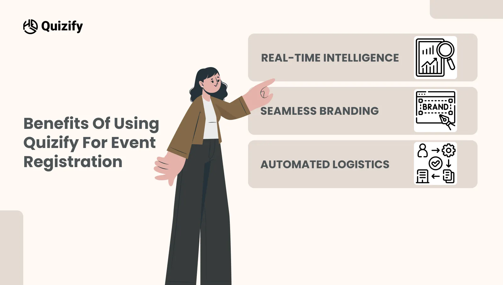
Big-name organizers aren't ditching static forms just because they’re ugly; they’re ditching them because static forms are where data goes to die. If you want to sell out, you need an engine that actually works for you.
Real-Time Intelligence
We’ve all been there: staring at a messy spreadsheet on a Tuesday night, trying to guess which LinkedIn ad actually sold a ticket. Quizify gives you a live X-ray of your event. You can see exactly which tiers are flying off the shelf and which ads are just sending you "tire-kickers". Stop waiting for a post-event autopsy, fix your marketing while the campaign is still live and double down on what’s actually filling the room.
Seamless Branding
Your event is a premium experience. Your registration should feel like the "VIP Entrance", not a detour through a generic, clunky basement. Most forms look like a sketchy plug-in that makes people hesitate right when they’re reaching for their credit card. We make the transition from your site to the form invisible. By matching your exact fonts and colors, you get rid of that "security suspicion" and keep the professional story going until they hit submit.
Automated Logistics
The "Admin Grind" is where planners go to burn out. Stop losing hours to the copy-paste trap or manually emailing PDF tickets. Think of Quizify as your 24/7 digital chief of staff. The second a guest hits submit, the boring stuff happens automatically: "You’re In!" receipts fire off, QR-code tickets are generated, and "Save the Date" invites hit their calendars. You aren't just automating a form; you’re buying back your time so you can focus on the actual event.
How Do You Manage Global Logistics and Compliance?
If you’re hosting a global event in 2026, your form isn't just a front door, it’s a border crossing. One "vague" checkbox or a messed-up clock, and your "Sold Out" success becomes a customer support nightmare. Here’s how to go global without the headache:
Is Your Form a "Security Risk" or a "Trust Builder"?
People are paranoid about their data, and for good reason. A shady, "bundled" consent box is an instant conversion killer.
The Strategy: Don't just "check a box." Tell them exactly what you’re doing with their email. When a guest sees you respect their privacy as much as their time, that "Security Suspicion" vanishes. High trust = high conversion. Period.
Fixing the "Time Zone Tension"
There is nothing more annoying than a "Save the Date" that defaults to the wrong side of the world. It’s a silent friction point that leads to "No-Shows" and a mountain of frustrated emails from people who missed your keynote.
The Strategy: Stop making them do the math. Just detect their browser offset automatically. Whether they’re in Tokyo or Toronto, their "Add to Calendar" link should work the first time perfectly. In a borderless world, accuracy isn't a "luxury"—it’s the bare minimum for decent customer service.
Once you’ve solved for global reach, you must optimize the visual experience.
The 3-Minute "Is My Form Leaking Cash?" Health Check
Design is the foundation, but data is the fuel. Even a perfectly designed form needs to be stress-tested against real-world behavior. By moving from a 'set it and forget it' mindset to an active audit of your conversion data, you ensure that no attendee slips through the cracks.
Stop guessing and run this quick 3-minute diagnostic on your funnel.
1. The "Third Door" Rule
Look at your analytics. If 50% of people are dropping at the same spot (usually the "Work Phone" or "Company Tax ID" field), remove that field. If you don't need it to run the event, it’s just a locked door between you and a sale.
2. The "Stare" Test
Open your ticket selection page. If you have to stare at it for more than 5 seconds to understand the difference between "Silver" and "Executive Pro", your guests are suffering from Analysis Paralysis. Simplify your tiers or add a "Most Popular" badge. Confusion is the ultimate "No".
3. The "Thumb" Audit
Open your form on your phone. If you have to pinch-and-zoom or if your "Submit" button is hiding under the pop-up keyboard, you aren't just losing people, you’re effectively invisible to 60% of your audience. If it doesn't feel like a native app, it’s broken.
4. The "So What?" Check
Read your CTA button. If it says "Submit", it sounds like a chore. If it says "Claim My Seat", it sounds like a win. Change the language to focus on what they get, not what you want.
5. The "Dead Air" Test
Hit submit yourself. Does the screen just go white? Does it take 10 seconds to load? If there’s no immediate "You’re In!" or a loading bar, people will refresh the page or double-charge their cards. Fast is professional.
Ready to Fill Those Seats?
You didn’t get into event planning to manage spreadsheets or fight with broken input fields. You’re here to build an experience people actually remember.
Don’t let a clunky form stand between your vision and a sold-out venue. Your speakers are ready. Your venue is waiting. It’s time to start treating your attendees like guests the second they find you.
Stop Collecting Data, Start Building Momentum
At Quizify.io, we’ve helped 7,000+ planners flip the script. We’ve turned boring registration into a strategic advantage.
The Reality: Build your high-conversion funnel in under 15 minutes.
The Promise: No coding. No credit card "gotchas". Just a fast, frictionless path to a full house.
The "maybe" is waiting to become a "yes". Give your attendees the “First Impression” of your event they deserve.
Similar Topic
Free Customer Feedback Survey Template
Getting started does not have to be complicated.Quizify includes a ready-to-use customer feedback survey template so you do not have to build one from scratch. It is designed to:


FAQ
Frequently Asked Questions
Do I need to rebuild my registration form for every event?
Not necessarily. Sometimes, copy-pasting the exact registration form for every event is fine. But, different events like a webinar, a networking event, or a VIP retreat will each require different sets of attendee information. Because of this, you should always review your registration form before event registration and remove any irrelevant fields.
What happens if attendees enter the wrong information?
That is a common problem. For example, people might mistype their emails, select the wrong ticket type, or simply forget their details. Allowing attendees to update their registration information can Much reduce the number of follow-up cases your team should handles manually.
Should I allow group registrations?
If you organize conferences, workshops, or corporate events, letting group registration can be a bonus for your attendees. Instead of requiring individual signups, one person can arrange the entire team's attendance and add individual details later.
When should registration open for an event?
It depends. Small virtual events might only need a couple of weeks to gain attendees, whereas large conferences generally require their registrations to be open months ahead. The more an attendee has to prepare, the longer in advance you should open registration.
Should I keep registration open until the event starts?
Not really. Closing registration a little early gives your team time to finalize attendee lists, prepare event logistics, and deal with any last-minute issues. It can make the event run much more smoothly.
Is a waitlist worth adding after tickets sell out?
Yes. Plans change, and some attendees may cancel before the event. A waitlist gives you a list of people ready to take their place.
What's the biggest registration mistake event organizers make?
Adding unnecessary fields to the form. The longer the form gets, the higher the chance that people will stop filling it out. Keep it simple and only collect important information.
What should I look at besides total registrations?
Don't just count how many people registered. Look at how many completed the form, how many attended the event, and where your attendees came from. These numbers can help you make better decisions for future events.