Lead Capture Form Mistakes: 5 Common Problems and How to Fix Them
Engagement Strategies
7 Min Read
Discover the 5 most common lead capture form mistakes, too many fields, weak CTAs, mobile errors, and how to fix each one to boost conversions.

Lead Capture Form Mistakes quietly cost teams qualified signups every day. A lead capture form can lift a funnel or quietly sink it. When signups stall, the reason is often simple: too many fields, a vague promise, or a clumsy mobile experience. Fortunately, these issues are fixable without a redesign. In this guide, you will see five Lead Capture Form Mistakes, practical fixes, and a short plan to measure impact so your form conversion rate improves for clear reasons.
Before you change anything, set a baseline. First, define what counts as a conversion for this lead capture form. Next, track starts, completions, time to submit, and field error rates. Finally, segment by device, because mobile and desktop tell different stories. With those basics in place, every change below becomes measurable and repeatable.
Mistake 1: Asking for Too Much Too Soon
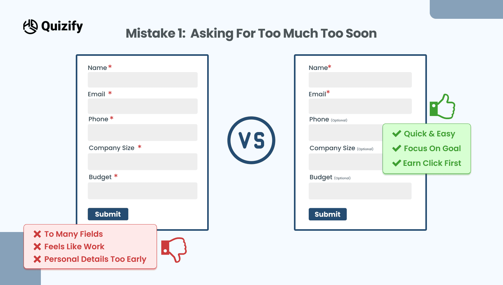
Long forms feel like work, especially on a phone. If the first screen asks for name, email, phone, company size, and budget, many people will pause and then bail. In addition, optional fields disguised as required create doubt and slow everything down.
How to fix it
Start with the minimum and earn the right to ask for more. Begin with email and one qualifier that actually helps routing. Then mark truly optional fields as optional and move them after the visible payoff. If you still need more data, add a short follow up step after submit while trust is higher. Also, use the right keyboard for each input, such as a number pad for the phone. Small touches make a form feel fast.
What to watch
Completion rate should rise within a few hundred visits. If quality dips, reintroduce one high-signal field and test again. The goal is a lead capture form that balances volume and fit.
Mistake 2: Weak or Invisible Value Above The Form
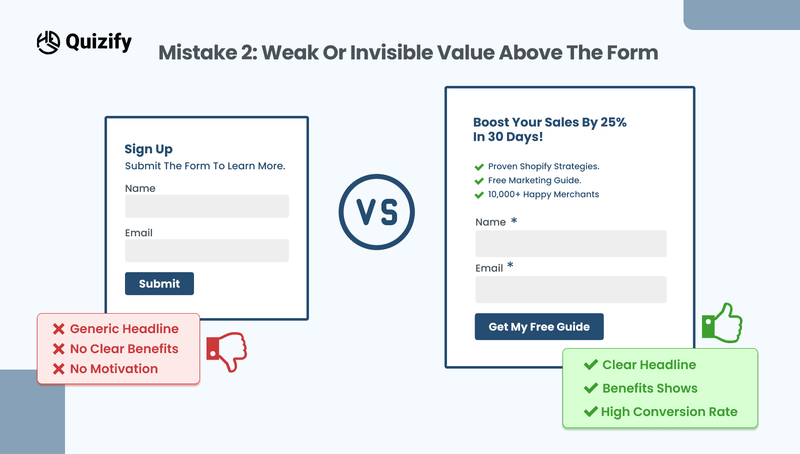
People do not fill out forms for the sake of it. They fill them to get something that feels worth the trade. When the copy above your lead capture form says “Sign up to learn more,” visitors cannot see the payoff. As a result, they hesitate and your form conversion rate slips.
How to fix it
State the outcome in plain language. For example, “Get the 7-step onboarding playbook” or “See your best-fit plan in two minutes.” Then add one proof point near the form, such as a short testimonial or a customer count. Finally, set a time expectation like “Takes under one minute.” These cues reduce uncertainty and nudge the click.
What to watch
Starts should climb first. If starts go up but completions stall, the promise is stronger than the experience. In that case, trim one field, shorten the intro, or clarify the next step.
For layout patterns that connect value to form placement, browse the Quizify blog and mirror a structure that matches your audience.
Mistake 3: Confusing Labels and Unhelpful Errors
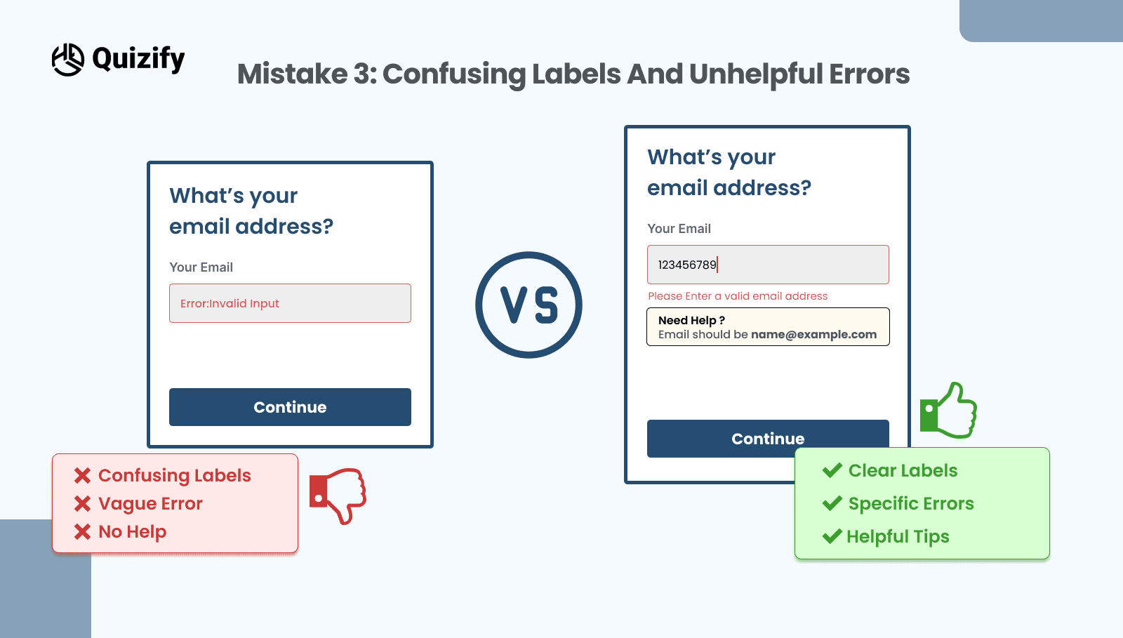
Placeholder-only fields, cryptic error messages, and validation that fires only at submit cause avoidable exits. Moreover, inaccessible patterns make recovery hard for everyone.
How to fix it
Keep labels visible above or beside the field so people never lose context. Validate on blur so mistakes surface early. When an error appears, keep it short and specific, for example, “Enter a valid work email.” Style errors clearly but calmly with a red outline, a small icon, and one helpful hint.
What to watch
Field-level error rates should drop. Time to submit should fall as well. Consequently, your form conversion rate rises without changing your offer.
Mistake 4: Ignoring Mobile Ergonomics
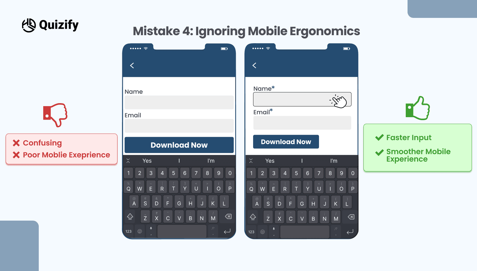
On small screens, tiny tap targets and cramped spacing create invisible friction. Likewise, a floating header or chat widget can hide the submit button just when someone wants to tap it. Even a strong offer will not save a clumsy mobile layout.
How to fix it
Size every primary target to at least 44 by 44 pixels. Trigger the right keyboard for each input and turn off auto-capitalization for email fields. Keep the main action within easy thumb reach and separate it from secondary links to prevent mis-taps. If the page is long, consider a second submit button near the bottom so no one has to scroll back up.
What to watch
Mobile completion rate should improve. If it does not, check whether a sticky element covers the button. Then adjust the position or delay nonessential widgets until after submission.
Mistake 5: All-Or-Nothing Gating and Trust Gaps
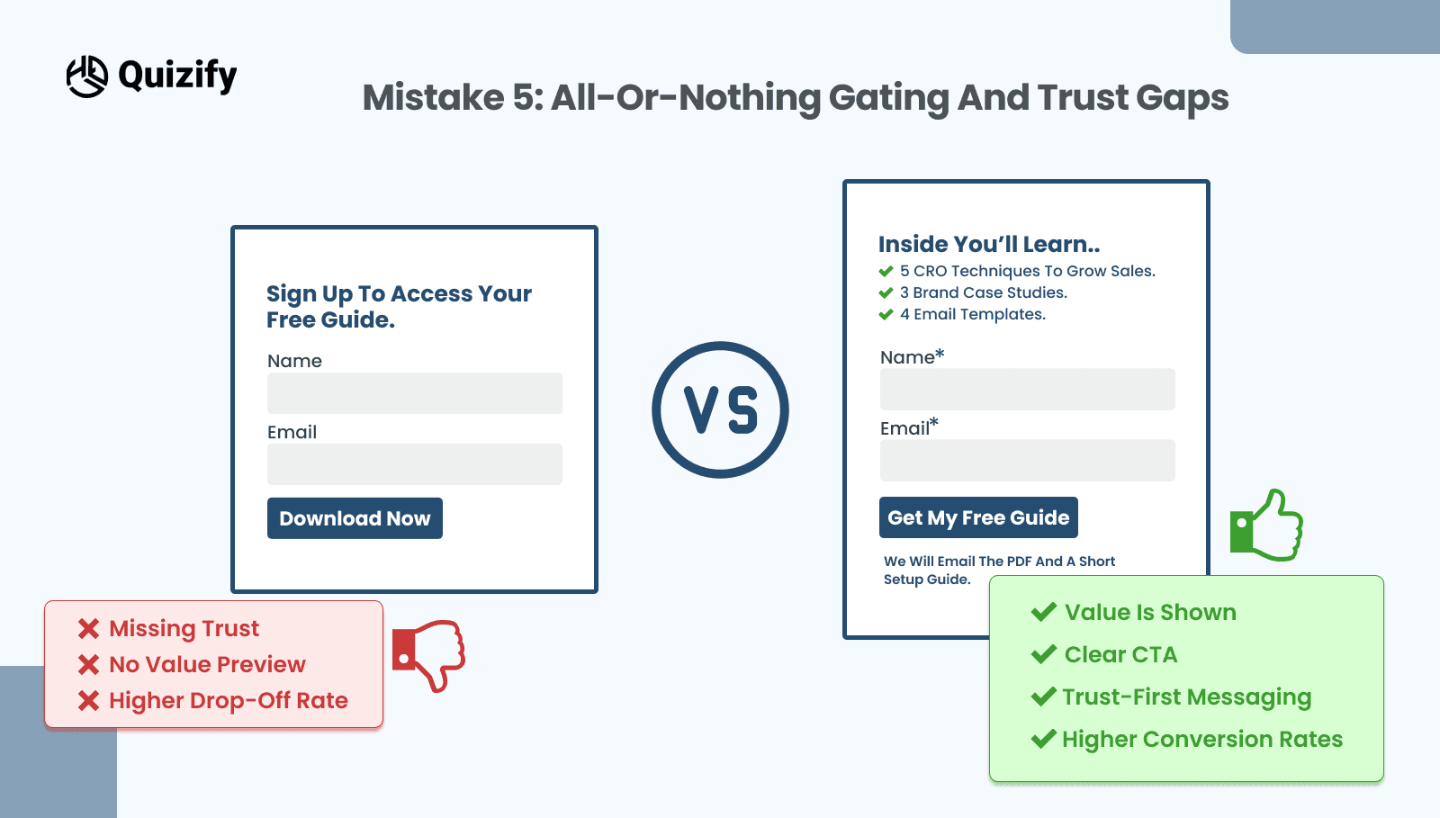
Hard gates break momentum. If a page promises “Download the checklist” but demands company, phone, and budget before anything appears, people feel baited. In the same way, missing privacy notes and unclear next steps create doubt that stops a lead capture form at the last moment.
How to fix it
Offer a soft gate when possible. Let visitors preview a page or see part of a result, then invite them to save or receive the full version. Place a brief privacy line next to the email field, such as “No spam. Unsubscribe anytime.” Clarify what happens after submission, for example, “We will email the PDF and a short setup guide.” If you must ask for a phone number, explain why and who will call, and make it optional for the first contact.
What to watch
Spam complaints should remain low while total opt-ins rise. If lead quality slides, shift stronger qualifiers into a short follow up step and keep the initial lead capture form focused on the primary goal.
A One-Week Plan to Fix Lead Capture Form Mistakes
Testing does not need a new tool stack. Instead, run one simple plan so your team learns quickly and the numbers hold up.
Day 1: Baseline
Record current starts, completions, median time to submit, and error rates by field. Tag sources with consistent UTM parameters so comparisons stay clean.
Day 2 to 4: Ship one change
Choose the highest leverage fix. Usually that means trimming fields, rewriting the value message above the lead capture form, or improving validation and errors. Keep fonts, colors, and layout the same so the effect is clear.
Day 5 to 7: Read the results
Wait for a few hundred visits. Then compare completion rate, time to submit, and field errors. If only the desktop improved, plan a mobile-specific change next. If it starts increasing but finishes dropping, reduce the friction or temper the promise and test again.
Microcopy That Helps People Finish
Short helper lines lower anxiety. Use one or two of these near the form or under the submit button. Do not stack them all.
Takes under one minute
No payment or login required
We will email the guide and nothing else
You can update preferences at any time
Two quick questions left
Accessibility Fixes That Prevent Lead Capture Form Mistakes
Accessible forms convert better. Associate each label with its input, provide visible focus states, and ensure error messages announce to screen readers. Also, support keyboard navigation so users can move through fields without a mouse. These practices widen your audience and protect your conversion rate from needless drops.
Putting It All Together
Start with fewer fields and a clear promise above the lead capture form. Then keep labels visible, validate early, and write errors that actually help. After that, fix mobile ergonomics so taps are easy and the main button is always reachable. Finally, replace hard gates with small reassurances and a clear next step. As you ship each change, measure starts, completions, and time to submit. Therefore, every improvement has a number behind it and your form conversion rate climbs for reasons your team can explain.
If you want to study real quizzes and sign-up patterns, you can adapt. Take a look at the Quizify blog and pick a structure that fits your audience. With steady tweaks and simple tests, your lead capture form becomes a reliable source of qualified leads.
Read More: Lead Funnels: What They Are and How to Build Them
Join our newsletter list
Sign up to get the most recent blog articles in your email every week.
Similar Topic


