Quiz CTA examples: 10 Quiz CTAs That Actually Get Clicks in 2026
Marketing and Promotion
7 Min Read
Quiz CTA examples that actually work. Discover simple call to action ideas for quizzes, plus tips to increase quiz starts and completion rates in 2026.

Great quizzes do not fail because the topic is weak. In most cases, they fail because the entry point is not strong enough.
Users today do not spend time trying to understand unclear prompts. If the value is not visible immediately, they move on. If the effort feels high, they delay it. And if the next step is not obvious, they ignore it completely.
This is why a strong quiz call to action matters more than it looks. A strong quiz call to action makes things simple. When things are clear, users do not hesitate.
You do not need dramatic copy to improve performance in interactive quizzes. Clear wording, correct placement, and a strong match between promise and experience are enough.
Before going into Quiz CTA examples, it is important to understand what makes a CTA actually work.
What makes a strong quiz CTA ?
A good CTA works more like a small offer than just a button. In many lead generation quizzes users will skip the CTA if it does not clearly explain the value.
It needs to do three things:
Show what the user will get
Keep the effort simple
Match where the user is in the journey
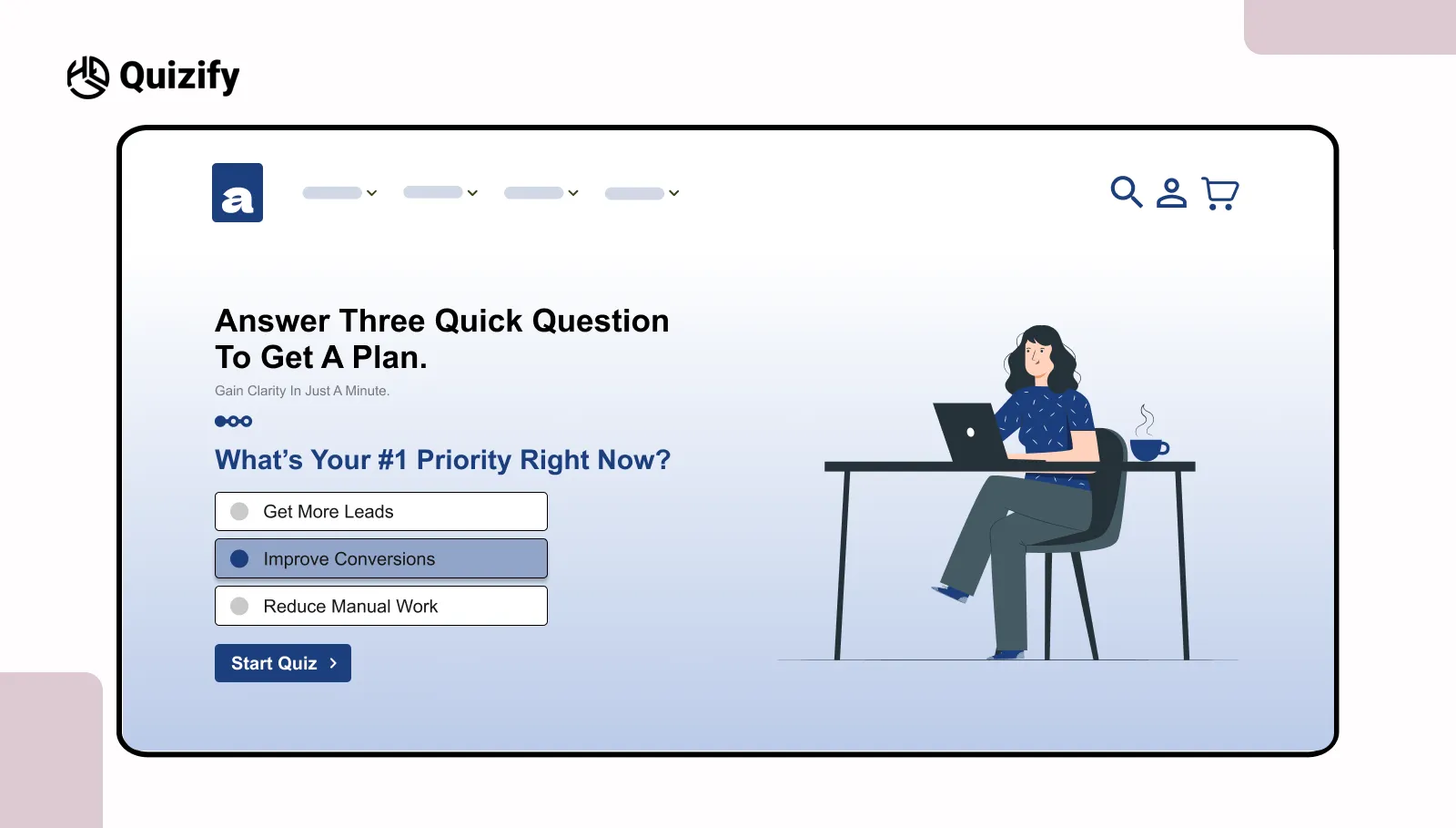
For example, “See your result” makes the outcome clear. “Answer 3 quick questions” makes it feel easy. When both are clear, users don’t spend time thinking about it. They just move ahead.
It also depends on when it appears. At the start, it should feel easy to try. In the middle, it should help users continue. At the end, it should make the next step clear.
If these don’t match, users pause. And that pause usually leads to drop-offs. Clarity matters more than clever wording. Words like “see,” “get,” or “start” are easier to understand. When the next step feels obvious, people don’t overthink it. They move.
1. Outcome first
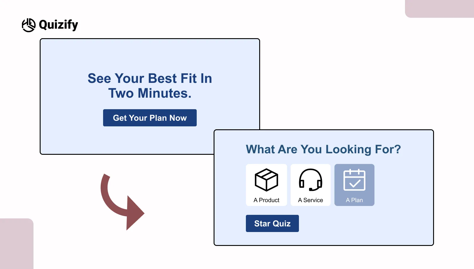
When users land on a page, especially from ads or search, they are usually trying to make a quick decision. They are not exploring much. They scan and look for something that gives them a clear answer.
This is where outcome-focused CTAs work better than general ones.
A line like “See your best fit in two minutes” works because it answers two basic questions at once: what the user will get and how long it will take. That clarity makes a difference.
The primary focus is on the outcome rather than asking the user to take a quiz. There is real utility in showing results rather than giving users an additional task to complete. This is effective in situations where users are comparing options or making quick decisions. For example:
Product match quizzes where users want recommendations
Price or plan selections that may feel confusing
Resources that guide users toward an end goal
Users can see the result before they click. Many users hesitate because they are unsure what happens next.
When that part is clear, users feel more comfortable starting without overthinking.
In simple terms, users are not clicking because it is a quiz. They are clicking because they expect a useful answer. When the outcome is clear from the start, users are more likely to take the first step.
2. Problem to Promise
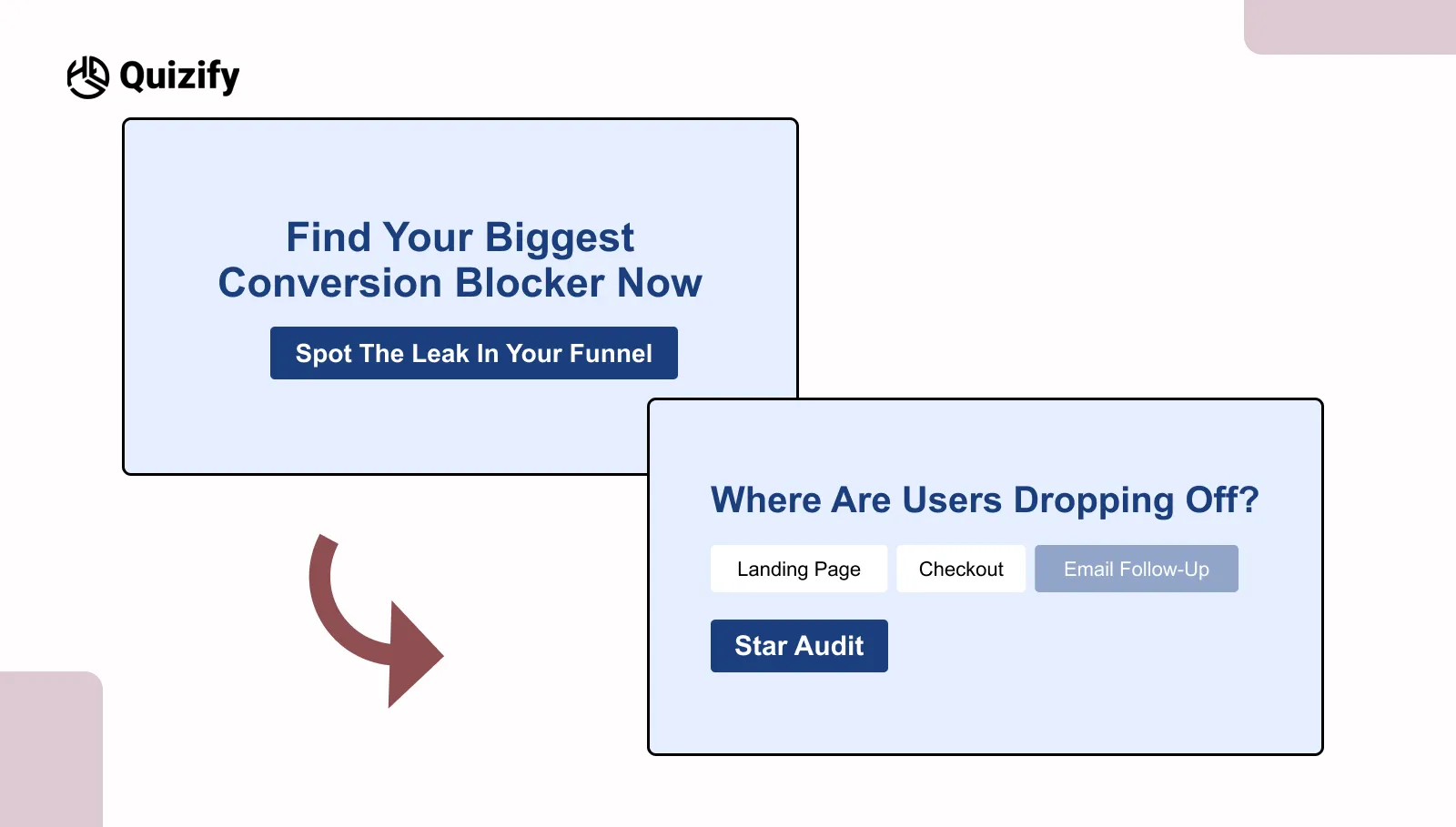
Not everyone comes to a page just to explore. Many people already have something in mind. They are trying to see what is not working or what they can fix.
In this case, a problem-based CTA works better than a general one. It speaks to what the user is already thinking about.
For example, “Find your biggest conversion blocker” works because it feels direct. It sounds like the user’s own question. It doesn’t feel like extra effort. It feels useful.
This approach is common in a quiz funnel where users are already searching for answers.
For example:
Reading a blog about growth or performance
Visiting a page about improving results
Taking an audit or check-type quiz
People respond better because:
It matches what they are already thinking
It doesn’t feel forced
It gives a clear reason to click
There is also less hesitation. It doesn’t feel like starting something new. It feels like the next step.
One thing to be careful about: the CTA should match what the quiz gives. If it promises something clear but gives something basic, users lose trust and may stop.
In simple words, this works because it stays close to the user’s problem. It doesn’t try to change their focus.
When the CTA matches what users already have in mind, taking action feels easier.
3. Micro yes opener
Sometimes the issue is not the value of the quiz. It is how big the action feels at the start.
When something feels long or hard to understand people get hesitant. Even if the result is helpful many people delay starting because they think it will take much time or effort. A small yes opener helps by making the first step feel easy and small.
A tiny change in words can change how people respond.
Call to action words
What people think
A quick quiz with three questions that takes less than a minute
It does not take time
You will get a plan
You will see a result
Instead of asking people to do the whole quiz it just asks them to start with a small first step. This works especially well in lead generation quizzes where users hesitate at the first step.
This way works well on pages where people leave fast or just glance at the content such as:
Home page
Pricing page
Landing page, with lots of people leaving quickly
When people take the step doing more usually feels easier. It no longer feels like much work.
However the experience still needs to match what you said you would do. If you say "3 questions" but the quiz feels longer people notice the difference quickly.
That breaks trust and increases drop-offs. In simple terms, this approach reduces the weight of starting, which is often the hardest part.
Small entry points make it easier for users to begin, without changing the overall experience.
4. Social proof nudge
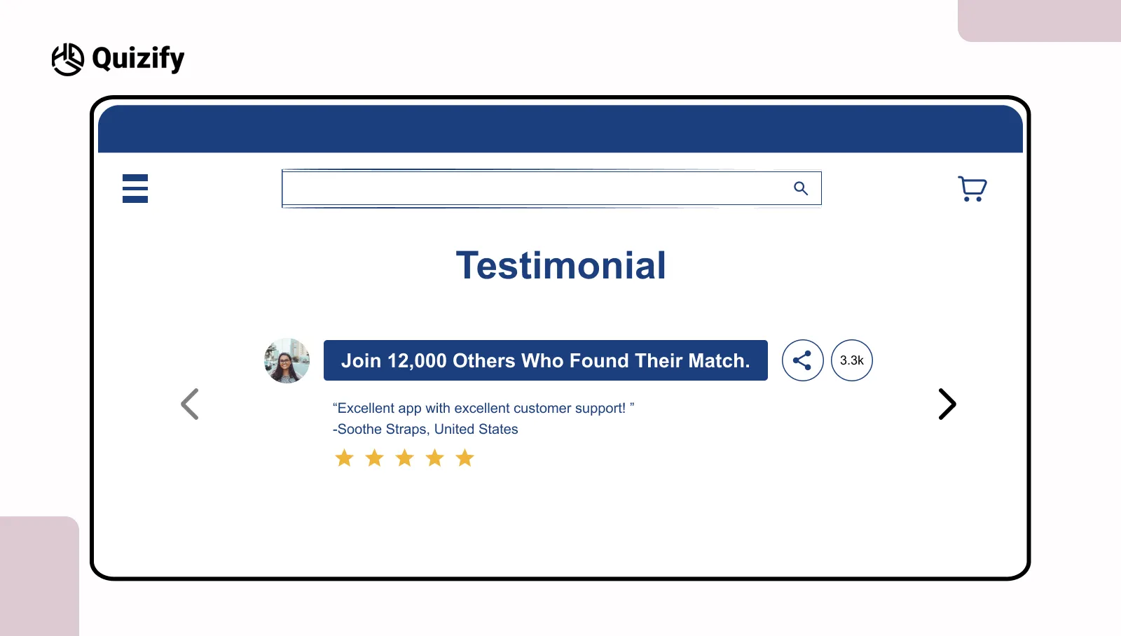
Users usually don’t take action without some kind of validation. Before clicking, they look for small signs that show if something is worth their time.
This is where a CTA with social proof helps. It shows that others have already taken the same step, which makes users feel more sure.
A small change in wording can make this clearer:
Without proof | With proof |
Start the quiz | Join 12,000 others who started |
Find your match | Thousands found their match |
Instead of showing the quiz as something new, it shows it as something others have already tried. This lowers the sense of risk.
This works well when users don’t know the brand or are deciding quickly. For example:
Blog pages where users are still exploring
Landing pages from social traffic
Pages introducing a new product or tool
The idea is simple. When users see that others have already done it, it feels safer to try. The decision doesn’t feel like they’re doing it alone.
At the same time, the proof should feel real. Numbers that seem too big or unclear can create doubt. Small and believable signals often work better than big, vague claims.
For better results, place the CTA near things like testimonials, user counts, or short reviews. This keeps everything aligned and easier to trust.
In simple terms, users feel more comfortable taking action when they see others have already done it. Trust signals reduce hesitation and make the next step easier.
5. Time bounded push
Time is one of the first things people think about before they click. If it’s not clear, they usually think it will take longer than it should. That small doubt can make them stop. Even if the quiz looks useful, not knowing the time makes them hesitate.
Many brands using an AI quiz builder use short time-based CTAs to improve starts. It tells people upfront how long it will take, so there’s less guessing.
For example:
Finish this quiz in under 90 seconds
One minute to your plan
Quick quiz with instant result
These work because they give a rough limit. It feels short and doable, not something that will go on for too long.
This helps when people don’t have much time or are just quickly going through content. For example:
Mobile users
Paid traffic where people decide fast
Short browsing sessions
The reason is simple. When people know the time, it’s easier to decide. It feels like a small task.
But it has to be true. If you say “90 seconds” and it takes longer, people notice. That can make them leave and not trust it next time.
In simple words, people are more likely to start when the time feels clear and not too long. Knowing the time makes it easier to try.
6. Result Teaser
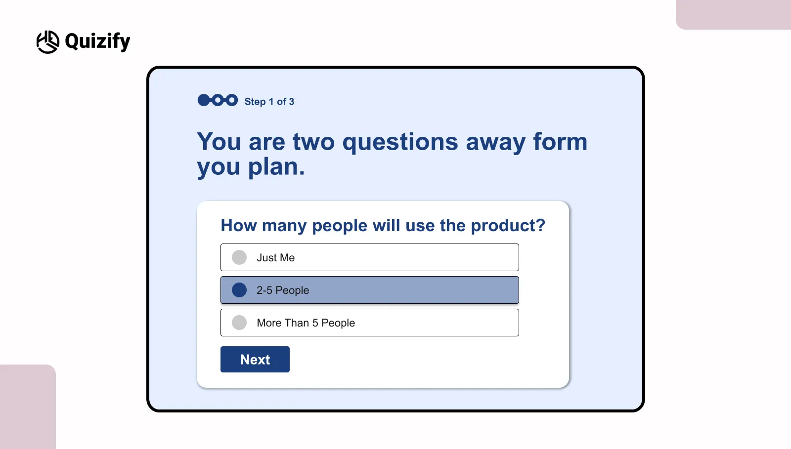
People usually start a quiz without much thinking. But after some questions, many slow down or leave halfway. At that point, the quiz starts feeling longer.
This is useful in longer quiz funnel flows where users may leave halfway.
These reminders are mostly added:
Near question 4 or 5
Before long questions
Where people usually leave the quiz
Simple lines like these are common:
You are two questions away from your result
Almost there
Your result is next
This helps users see that the end is near. They do not have to keep guessing how many questions are left.
When people know there is not much left, they are more likely to continue.
A lot of users leave because the quiz starts feeling long or tiring. Small reminders can help them stay until the end.
A simple progress reminder can help users complete what they have already started.
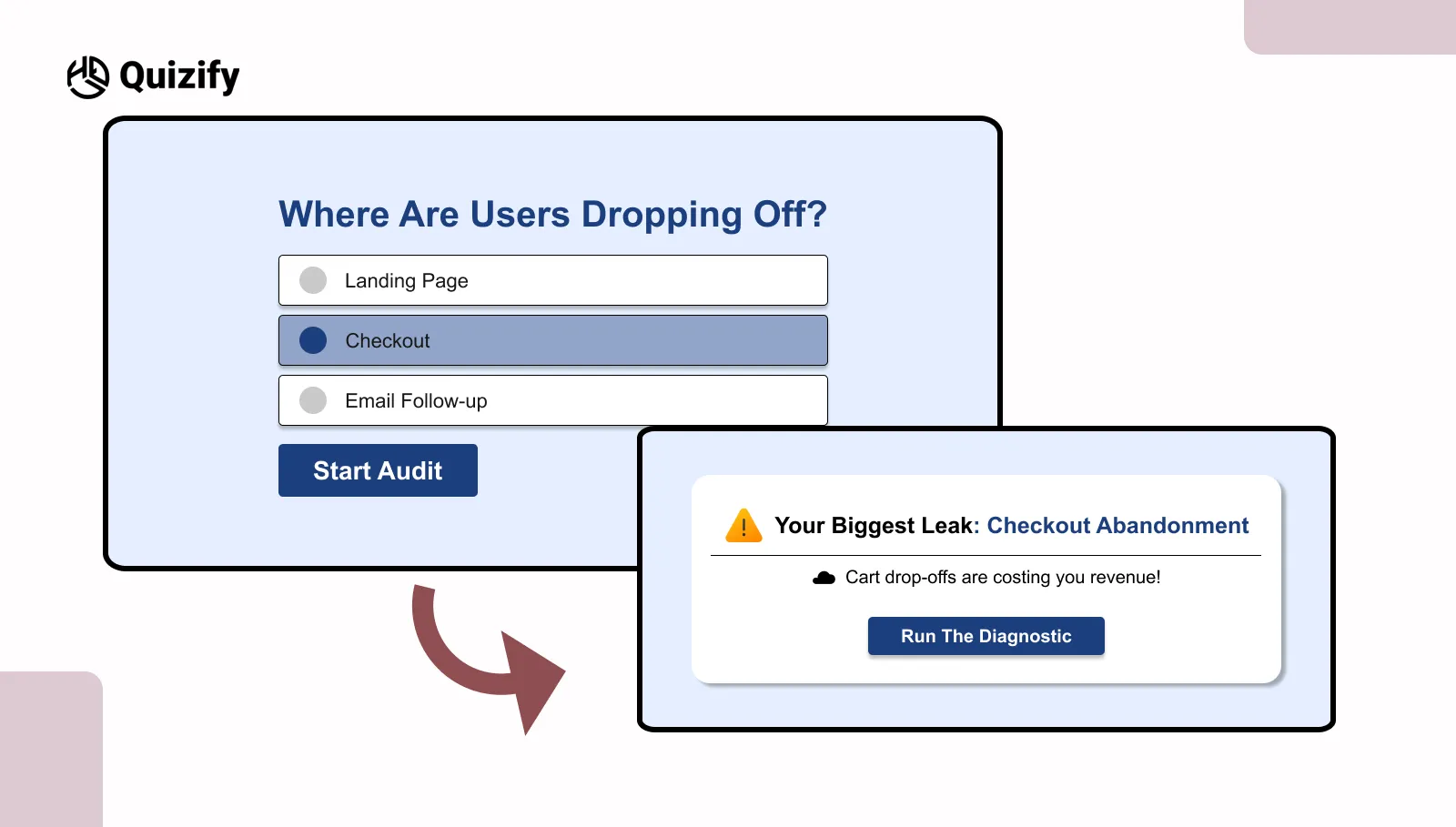
7. Risk reducer
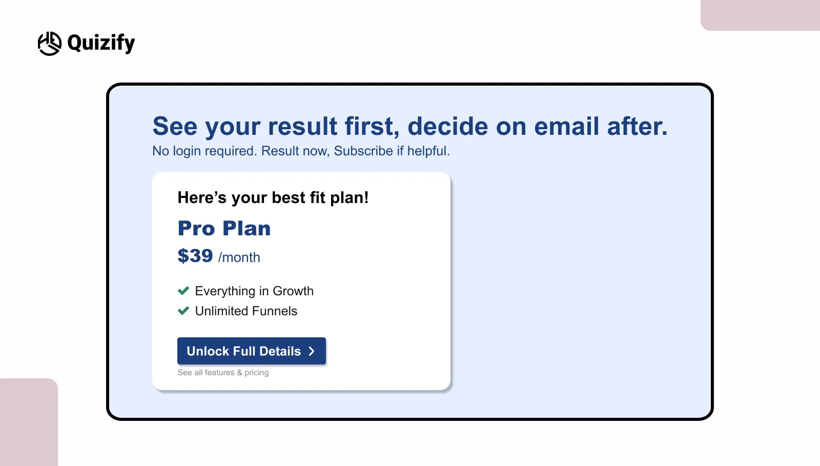
Many users don’t hesitate because of the quiz. They hesitate because of what might happen after they finish it.
They think they’ll be asked to sign up, give their email, or start getting follow-up messages. This thought alone creates resistance, even before they begin.
A risk-reducing CTA helps solve this. It answers these concerns upfront and removes doubt.
Common worries and how the CTA handles them:
Forced signup → no signup required
Spam emails → decide later
Data sharing → view result first
When these doubts are cleared early, the experience feels more open and easier to go through.
Simple lines like “See your result first, decide later” or “No login required” make things clear. Users don’t feel pushed or trapped.
This works because users feel in control. When they feel they can choose, they are more willing to take the first step.
This matters even more in lead generation flows, where people are careful about sharing their details. Removing that early fear usually leads to better engagement and more useful responses.
However, this should be used honestly. If the experience later forces a signup, users will notice the gap, and trust will be affected.
In simple terms, reducing perceived risk makes the action feel safer and easier to try. When users feel in control, they are more willing to engage without hesitation.
8. Personalized hint
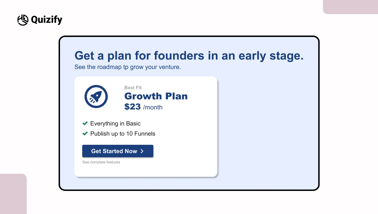
The same message does not work for everyone. Different users come with different goals. Something useful for one person may not matter to someone else.
Many tools with an AI quiz builder use this method to make quizzes feel more relevant.
For example:
Get a plan for early-stage founders
See recommendations for agencies
These messages feel more direct than a general CTA.
Segment | CTA focus |
founders | growth ideas |
agencies | client results |
educators | planning help |
This works better in quizzes that already ask simple things like role, goal, or industry. Even changing one small line can make the message feel more connected to the user.
When users see something related to them, they pay more attention. It feels less broad and more personal.
The change does not need to be big. Sometimes one edited line is enough. When the message feels closer to the user, continuing feels easier.
9. Clarify the next step
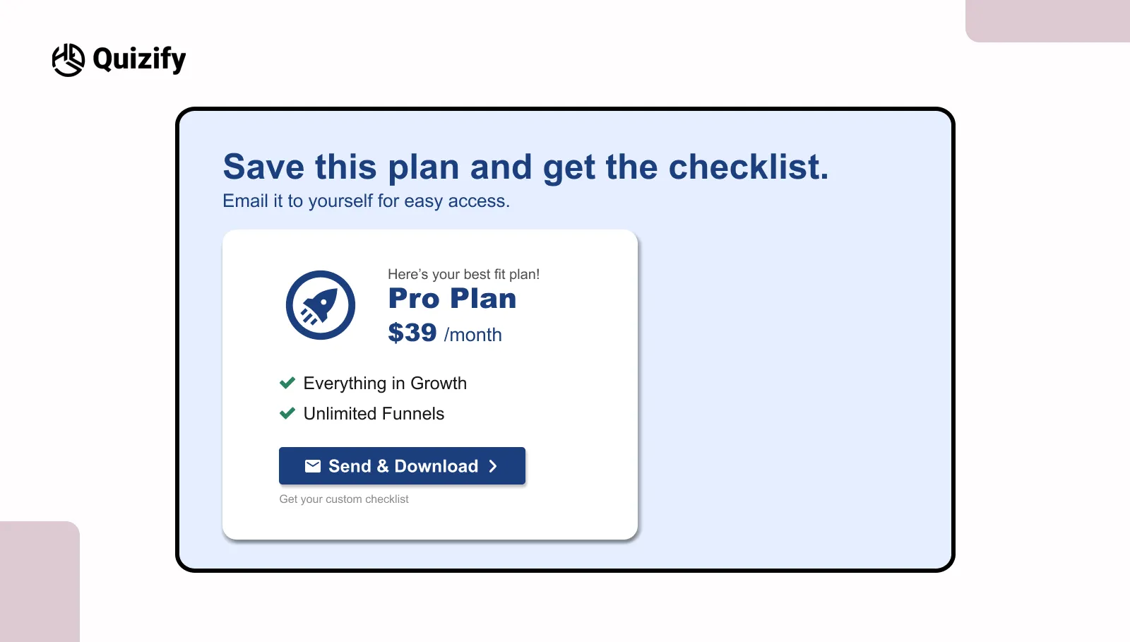
The result page should not feel like a stopping point. In many quizzes, users see the result and leave because they are not sure what to do next. Usually there is no clear next step after the result.
A CTA helps guide users forward instead of letting the flow stop there.
For example:
Save your plan and get the checklist
Download your next steps
Email this plan to yourself
These actions connect to the result the user already got.
A few simple things help:
Keep one main action
Place it where users can notice it fast
Avoid too many options
After seeing the result, users are already interested. If the next step is clear, they are more likely to continue.
But if users need to stop and think about what to do next, many leave the page.
The CTA should also match the result. If it feels random, users can lose interest.
The result page should help users continue instead of making the flow stop there.
10. Momentum carryover
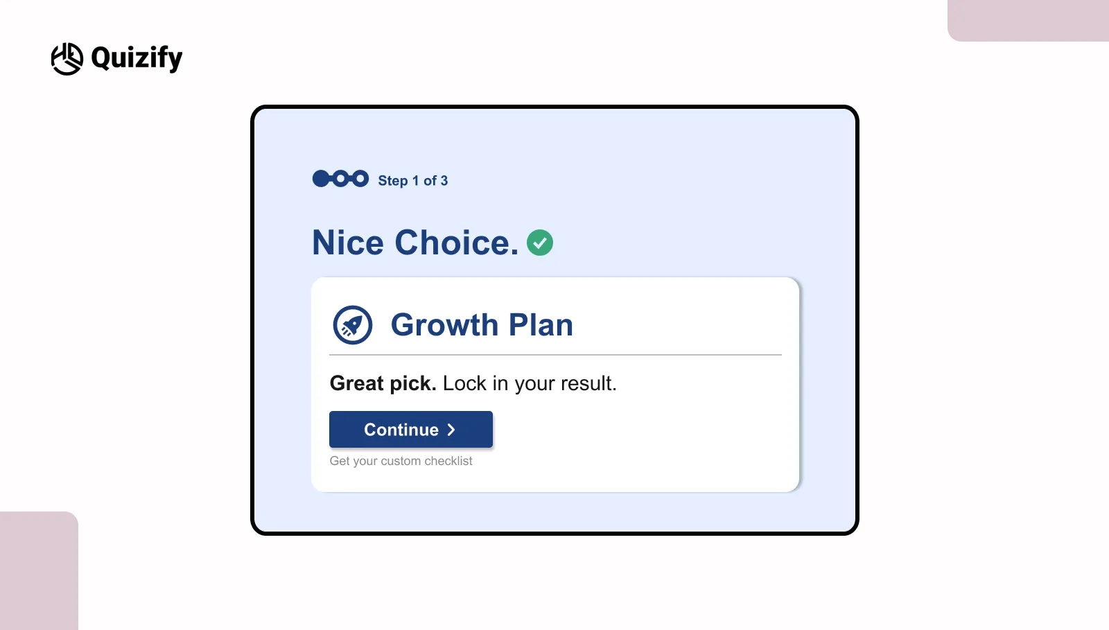
User flow in a quiz depends heavily on momentum. After each step, there is always a small pause. Users take a moment to process what they just did and decide whether to continue. This short pause is where many drop-offs happen, especially in longer quizzes.
This is where a momentum carryover CTA becomes useful, as it helps users move to the next step without breaking their flow.
Simple lines like:
Great choice. Continue to your result
Nice pick, keep going
can make a difference at this stage. These are not strong prompts, but small cues that guide the next action.
They are usually placed at points where users naturally pause, such as:
Right after an answer is selected
Just before the next question appears
Reduce friction across the full quiz flow
Most teams focus only on the start button, but drop-offs often happen in the middle or near the end.
Many businesses use an online form creator or survey builder together with quizzes to reduce drop-offs. It is about reducing friction across the full journey.
Friction can come from small issues such as:
Too many questions without progress feedback
Unclear transitions between steps
Unexpected email or signup prompts
Repeated or similar questions
These points may seem minor, but they affect how users feel while moving through the quiz.
Instead of adding more prompts, it is often better to remove confusion.
A simple way to review this is:
Stage | Common friction | Fix |
Start | Unclear value | Clearer CTA |
Middle | Effort feels high | Progress cues |
End | Unclear next step | Strong result CTA |
When friction is reduced, users do not feel the need to stop and think. The experience feels smoother. A smoother flow keeps users engaged from start to finish.
Common mistakes to avoid in quiz CTAs
Sometimes CTAs just don’t work. Not because they’re badly written, but because of small things that get missed. They look minor, but they still affect how people react.
A few common ones:
Using words like “submit” or “continue” without saying what happens next
Promising something the quiz doesn’t actually give
Putting too many CTAs on the same screen
Asking people to sign up before they see any value
Using the same CTA style again and again
When users notice these things, something feels off. They pause. And once they pause, many don’t continue.
Another thing people get wrong is focusing too much on the wording. The flow matters just as much. Even a good CTA won’t help if the quiz feels long or a bit disconnected.
So the goal isn’t to be clever. It’s to be clear and consistent.
Most of the time, fixing these small issues works better than trying something new. Even small changes can improve how people respond.
Final takeaway
Good quiz CTAs aren’t just about writing better lines. They’re about making the next step feel simple at every stage.
From the first click to the final result, each step should feel clear. Users shouldn’t have to guess what happens next.
Small tweaks in wording, timing, or flow can make a big difference. You don’t need to rebuild the whole quiz.
The best way to improve is simple—test things, watch what people do, and adjust.
Over time, CTAs become one of the most important parts of your quiz funnel. When they’re clear, people move forward without thinking twice.
FAQS
What is a quiz call to action?
A quiz call to action is the message or button that asks users to start a quiz continue a quiz or finish a quiz. It helps users understand what they will get from a quiz and what to do next in a quiz.
Why are quiz calls to action?
Quiz calls to action are important because they help users move through a quiz without getting confused. A clear quiz call to action can improve the number of people who start a quiz the number of people who complete a quiz and the results of generation from a quiz.
What makes a quiz call to action work better?
A good quiz CTA is clear and simple. Users should be able to understand what they will get from a quiz how long a quiz will take to complete and what happens next after a quiz.
Some things users should know about a quiz are:
What they will get from a quiz
How long a quiz will take to complete
What happens next after a quiz
What are some examples of quiz call to action text?
Some simple examples of quiz call to action text are:
Start the quiz
See your result from a quiz
Get your plan from a quiz
Find your match from a quiz
There in a quiz
Should quiz calls to action mention time?
Yes, quiz calls to action should mention time because time-based quiz calls to action often work well. Users know what to expect from a quiz when time is mentioned.
Examples of time-based quiz calls to action are:
Takes than one minute to complete a quiz
Finish a quiz in 90 seconds
Quick quiz with result, from a quiz
Join our newsletter list
Sign up to get the most recent blog articles in your email every week.
Similar Topic