Multi-Step Forms vs. Single Form: Conversion Tips and Test Plan
Marketing and Promotion
8 Min Read
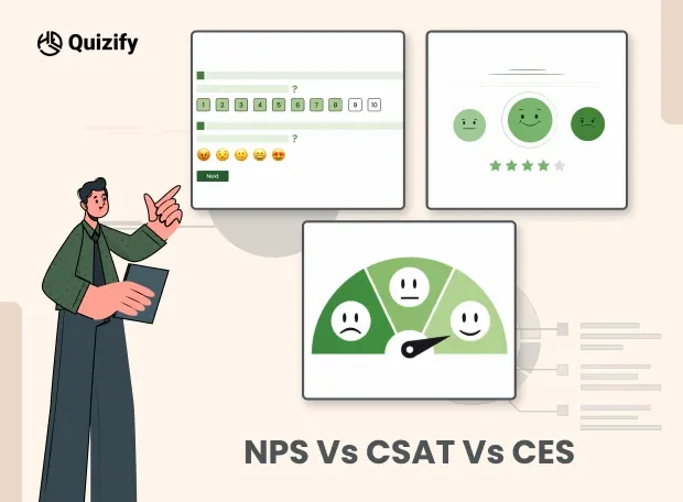
Multi-step form or single page form. See when each layout wins, avoid common mistakes, and use a simple A/B test plan to pick the right option for your funnel.

If your signup rates are dropping or conversions feel stuck, your form layout could be the hidden reason. Choosing between a multi-step form and a single-page form directly impacts user experience, perceived effort, mobile usability, and overall conversion rates. The right structure can reduce friction, improve error handling, and increase completions, especially for mobile visitors. In this guide, we’ll compare multi-step vs. single-page forms, share practical conversion optimization tips, and outline a simple A/B test plan so you can make data-driven decisions that boost results.
An Overview of Each Layout Type
Multi-step form
A form split into short screens. Each step collects a small group of fields and shows progress with clear Next and Back actions.
Single-page form
All required fields live on one screen. Users can scan everything at once, scroll, complete, and submit in a single move.
When a Multi-Step Form Wins
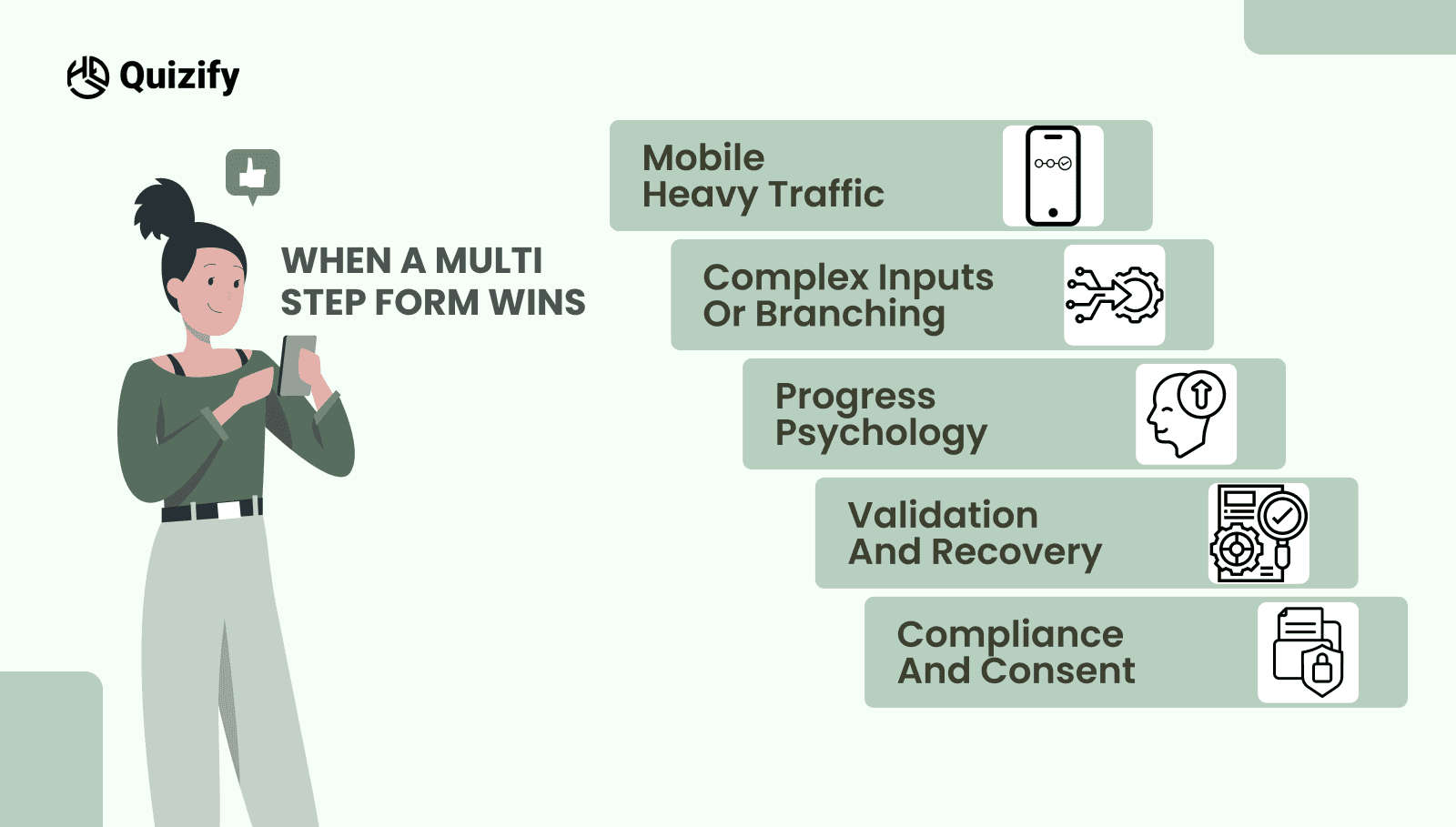
Mobile heavy traffic
A multi-step form reduces perceived effort by chunking questions. A clear indicator such as Step 2 of 5 keeps people moving.Complex inputs or branching
Conditional logic, file uploads, or role-based paths are easier to understand in steps. Context stays focused, and confusion drops.Progress psychology
Small wins motivate me. Short steps with visible progress reduce mid-flow abandonment.Validation and recovery
You can validate as people go, catch errors early, and save partial progress. Losing everything at submit is less likely.Compliance and consent
If legal text needs space, a multi-step form can place it where it is relevant, not as a wall at the end.
When a Single-Page Form Wins
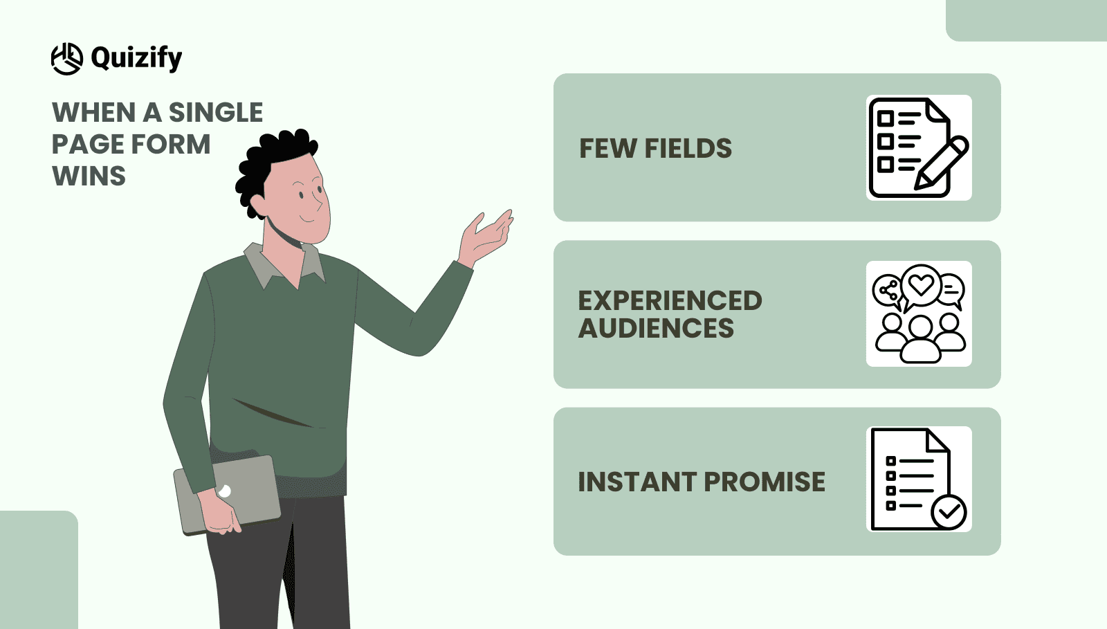
Very few fields
If you only need a name, email, and one qualifier, a single-page form removes extra clicks and feels fast.Experienced audiences
Technical users often prefer scanning all fields, filling quickly, and submitting without interruptions.Instant promise
For events, waitlists, or free resources, one page aligns with the promise of speed.
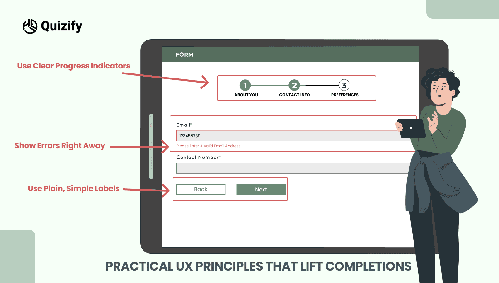
Practical UX Principles That Lift Completions
1. Set Clear Time Expectations
Let users know how long the form will take.
Why it helps:
When people see “Takes less than 2 minutes,” they feel more comfortable starting—especially on mobile.
Simple example:
"Quick form—takes under 2 minutes to complete.”
2. Use Plain, Simple Labels
Write form labels and instructions in everyday language.
Why it helps:
People understand forms faster when you avoid technical words or jargon.
Tip:
Should the use of complex terms be necessary, kindly provide explanations through small tooltips.
3. Show Errors Right Away
Tell users about mistakes as soon as they move to the next field.
Why it helps:
Users don’t get frustrated by fixing errors at the end.
Best practice:
Please display the error beside the field and provide a brief explanation on how to resolve it.
4. Use Clear Progress Indicators
If your form has multiple steps, show where users are and what’s coming next.
Why it helps:
People are more likely to finish when they know how much is left.
Better example:
"About You” instead of “Step 3.”
5. Make Forms Accessible for Everyone
Design forms that everyone can use easily.
This includes:
Proper labels linked to inputs
Keyboard navigation support
Clear focus indicators
Why it helps:
Accessible forms are easier for everyone—not just users with disabilities—and they convert better.
For best practices, follow trusted guidelines like W3C’s form accessibility standards.
Common Mistakes to Avoid
Splitting without purpose
Do not turn five fields into five screens. Group by meaning, not by database column.Hiding decision makers
If a field changes price, plan, or availability, do not bury it on step four. Keep deal breakers visible early.Front-loading friction
Password creation or payment details too soon can spike exits. Show value first, then ask for the high-friction fields.Sticky bars that cover content
On small screens, a fixed header or footer can hide the Next button. Test on real devices before you ship.
A Simple Test Plan to Pick the Winner
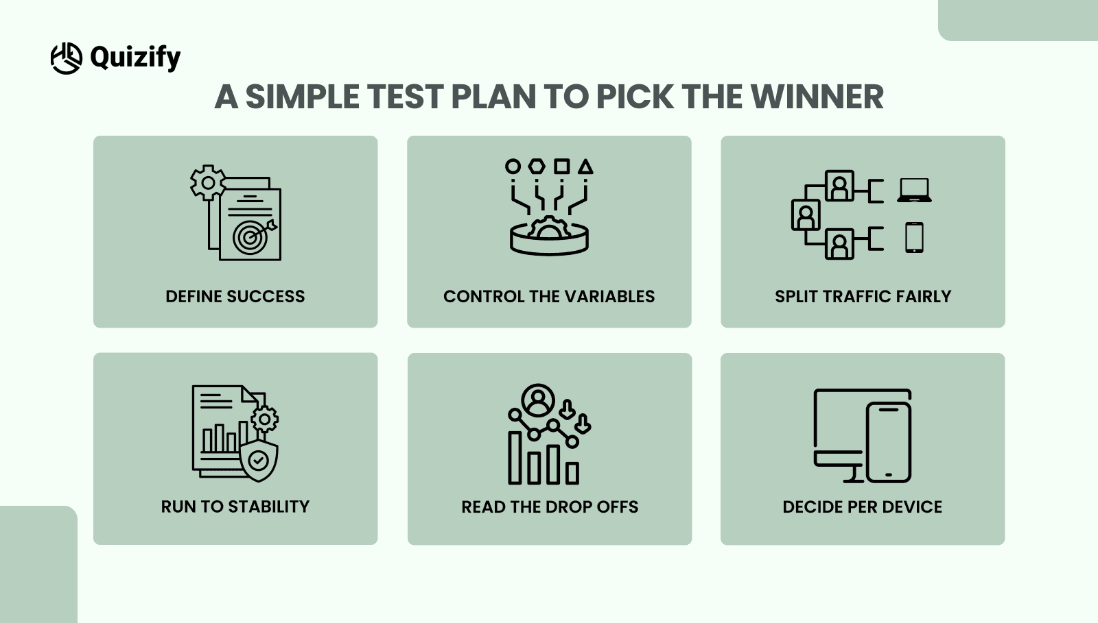
You do not need a new tool stack to test a multi-step form against a single-page form. Run this one-week plan.
Define success
Pick primary and secondary metrics. For signups, measure start rate, completion rate, median time to complete, and error rate per field.Control the variables
Keep labels, fields, colors, and copy identical. Only the layout changes between the multi-step form and the single-page form.Split traffic fairly
Please direct the same audience to both versions. If possible, split by device so you can read mobile and desktop separately.Run to stability
Aim for a few hundred starts per variant. Avoid calling a winner on the first day.Read the drop-offs
Do not stop at totals. In a multi-step form, note the step where exits spike. In a single-page form, check scroll depth and which fields cause the most errors.Decide per device
It is common for a multi-step form to win on mobile and a single-page form to tie or win on desktop. Keep the winner per device if your platform allows it.
Implementation Tips for Each Layout
If you choose a multi-step form
Group fields by means, not by department. Use clear step titles and a visible progress bar. Put the highest friction field near the end once the value is clear. Add Back for control and save on each step. Keep questions short and avoid open text when a choice will do.
If you choose a single-page form
Order fields from easiest to hardest to build momentum. Use generous spacing and clear labels so the page does not feel cramped. Keep optional fields truly optional and mark them clearly. Place privacy notes near the field they relate to, not as a block at the bottom. If the page runs long, add a second Submit near the bottom.
How to Decide in Five Minutes
Ask yourself three questions and follow the outcome.
How many must-have fields do we truly need?
Seven or fewer often favors a single-page form. More than seven lean toward a multi-step format.How much of our traffic is mobile
If most visitors are on phones, a multi-step form with short steps usually reduces drop-offs.Do we need branching, uploads, or payments?
If yes, steps keep context clear and reduce errors. If not, a single-page form may be simpler and faster.
Conclusion
There is no universal winner. Choose the multi-step form when you have many required fields, conditional logic, or heavy mobile traffic. Choose the single-page form when speed and simplicity are the promise and the form is short. Then confirm with a clean A/B test and keep the winning layout per device. The right choice is the one that lowers perceived effort without hiding decisions. Keep labels plain, validate early, and show progress, and you will see more people start, more people finish, and stronger data for the rest of your funnel. If you want structure ideas for quizzes and signup flows that lead into forms, browse patterns on the Quizify blog and adapt them to your layout.
Read More: Short-Form vs. Long-Form Quiz Results
Join our newsletter list
Sign up to get the most recent blog articles in your email every week.
Similar Topic